Today in School me and Jo decided to show our trailer to our friends. We gave them no clue about the trailer, we just asked them to sit down and watch it and give us feedback on it. Here is our feedback which we got:
Hannah: This trailer was really effective. I could definatly see this trailer on the big cinema screen! It also did it's job my making my job! well done girls!
Rachel: The story line to this trailer was really clear and understandle. I liked the bit were the killer was seen in the mirror whilst the victim was looking in the mirror. This was a really clever idea. I really enjoyed this trailer
Sam: I personally don't like horror trailers so I wasnt very interested, but from what I saw it was well thought out and a lot of effort had been put into it! The characters were clear of there character and the music really brought a chill to my spine. Well done
Friday, 9 December 2011
Monday, 5 December 2011
Editing the final bits of our trailer

Today me ad Jo edited the last bit of our trailer. Today it was our challenge to add in all the sound effects, add in fades and effects and also add in music. After housr of work we finally managed to do this. We used youtube and youtube converter for sound effects/music in which we personally emailed the creater of these sound effects/ music to ask them if it was okay to use these in our trailer. Thankfully the creater said yes and we began to add the sounds in. Me and Jo also spead bits up in the trailer and slowed bits down to make it look more effective. Ovreall me and Jo worked hard on editing our trailer and are very pleased with the outcome. the last bit of the trailer we have left to do is create and adveritsing logo at the beginning of the trailer.

Thursday, 24 November 2011
Editing our trailer
Today me and Jo started to edit our trailer. I personally didn't realise the amount of time it took to edit our trailer. Whilst editing our trailer me and Jo both realised that there were parts in out trailer that didn't really conjoin and flow. Therefore we decided to film a couple more clips. As we done these, we again added them into our trailer. The flow of the trailer itself makes a lot more sense and we are both happy with it. Most of the night me and Jo were placing the clips in order and creating the story line. After that we cut and edited each clip so the most exciting section in the clip was the bit being shown. After doing this to each and every clip, when then picked and choose what clips we wanted to put into our trailer. Again after choosing these our trailer was finally beginning to take place. All we have left to do is to edit the clips into one another and add sound effects.


Wednesday, 23 November 2011

Feedback on my film magazine cover
Today I got teacher to look and give me feedback on my film cover. She said everything about the film cover was good but she could see no similarities between my film poster and my magazine cover. she personally preferred my film poster as it looked a lot more scary and professional. What I have decided to do is change my picture on my film magazine cover. The picture I am going to use is one I took whilst filming my trailer. It consists of the my actor opening a mirror and the man in the mask is in the reflection of the mirror. The similarities now would be the man in the mask is on both of the posters. I also am going to change the yellow writing to black as I think the yellow writing is to bright and happy for the horror trailer. Black writing will fit in with the genre of horror. Also the I had re-arrange the writing on the left hand side on the magazine so it made more sense and read fluently
Tuesday, 22 November 2011
Re-Filming
Today me and Jo re-filmed our bits to add into our trailer. We had to re-film as some of the shots that we filmed which were to dark! We re-filmed a good 3 mintues of new footage! We also filmed new bits which we hadn't filmed before, re-filming gave us new ideas to put into our film trailer. To make sure that the filming wasn't to dark again we decided to film earlier on in the day and we also used a light in the next room which gave the camera more light! We are now ready to start finally editing are Film Trailer
Monday, 21 November 2011
My Final Magazine Front Cover

My changes made
Here is my Final Magazine Front Cover. I previewed my orginial magazine to my teacher and she guided me in the right direction and gave my advice. The changes I have made to my magazine cover are as followed; I made a spelling era at the top right, I mis-spelled Joanne's Name. I also deleted 'Pull out poster of Johnny Depp' I deleted this because Johnny Depp isn't really seen as a 'Horror' genered actor so It wouldn'y appeal to those reading the magazine. I also changed the daily mirror writing to the heading being 'Exclusive' I decided to put this as the word 'Exlcusive' draws the readres attention in more! I also made the picture look more brighter as it looked to dark and you couldn't make out the actor


Creating my Film Poster
Today I decided to take pictures for my Film Potser. I used a model and gave her a mask to wear as she is the main character in my film. We took many different shots, but found it very difficult. Where the genre of my trailer is horror I had to have the lightening pretty dark, but this didnt look very effective on the picture as it was too dark. We tried the using the flah on the camera but the flash reflected on the plastic mask. What we decided to do is use my porch as it does already have a light in it. As my trailer is about a man in a mask trying to get into the house we used the door to take pictures. I positioned my model behind the door and looking through. The glass on the door has a good effect as it makes the mask like smeared.
I used http://www.picnik.com/ to Edit my picture, I darkened my picture down, and used a blood effect on the glass of the door. I also cropped the picture as it was alot bigger, but I wanted the emphasis on the man behind looking through the door.
Here is my Final Shot

I used http://www.picnik.com/ to Edit my picture, I darkened my picture down, and used a blood effect on the glass of the door. I also cropped the picture as it was alot bigger, but I wanted the emphasis on the man behind looking through the door.
Here is my Final Shot
Thursday, 17 November 2011

Tuesday, 15 November 2011
Tuesday 15th November- Contuining editing my trailer
As I have been editing my ancillary tasks, I have also been editing my trailer. I have found editing was a bit of a strugle but I eventually have got the hang on it and discovered how to add in all different effects, from music, sound effects, other videos etc. I managed to edit a mojority of my trailer but had some awful news that a couple of my shots were to dark and the audience couldn't make out what the objects were in the film. Therefore today and tommorrow I will be filming be shots needed and getting back on with editing my trailer and adding them new shots in. This has delayed me with my editing but It will look alot better when my shots are brighter, I believe the story line will be alot clearer if the shots can me seen.


At the beginning of my trailer I need to create a advertising trailer. I have to think of some names that I could use also. I will also be creating this today. Some advertising trailers that are very known are:
Warner Brothers etc.
http://www.youtube.com/watch?v=ixIT-gON4Hs
I hope to create my advertising trailer along the samer lines as one of these. I will be posting print screens of my process of making my trailer logo
Tuesday 15th November
 Today I have again made changes to the front cover. I have moved the text from the bottom of the front cover to the middle underneath the other text on the left hand side of the magazine font cover. I have also changed what the the deep red text said. I have changed it because I believe what it said before was more or likely to be put on a poster advertising the film. I have also added a picture of black and yellow tape at the bottom of the front cover to add more effect. As you no yellow and black tape means stay away and danger, so this is why I put it there.
Monday, 14 November 2011
Monday 14th November- Film Poster Magazine front cover continued....
 This is my Film Magazine front cover continued. I have moved the text at the bottom onto the left hand side which makes it look more like a professional film magazine poster! I have also added in a bar code to also make it look more realistic. I have added in text on the left hand side of the magazine which again makes the magazine look more professiona. I like the colour of the text as it is very bright and it stands out, which catches the audiences eye. All I have to do now is pick a picture to put on the front of the magazine. Again I will continue making changes
Saturday, 12 November 2011
Editing My trailer
Me and Jo began to edit our trailer using the apple mac computer at school. As I said on my post when we first started filming, me and Jo found it very hard to use. Also it wasn't suitable as me and Jo wanted to use the computer after school and at weekends. We also couldnt acssess the mac at all time because other students would be using it too. We therefore mad a decision that we should not use the mac. As we both have laptops with Windows 7 on it, we decided to use Windows MovieMaker on our laptops. I think that Windows MovieMaker is alot more complex to use and I personally understand it more. Since using this software I have learnt how to add in videos and music from youtube and convert it. Also I have learnt how to fade out and fade in shots. I have learnt how to cut shots, and how to make the music I have used start at a certain time. Windows MoveMaker is definatly more easier to use, and I have learnt various things that I can now use in the future. I also had to edit the brightnessof my shots because some of them came across to dark. Im hoping they wont be too dark, and that I will have to re-film! My trailer so far is looking good, and I hope to continue the high standard of work throughout. I am now looking at high pitch screams and sudden noises e.g bangs, door slams to use in my trailer to make my audience jump as this is my main purpose of my Teasor Trailer.

This is the Apple Mac 'Final Cut Pro' software that I began using, but then swoped to the Windows MovieMaker as it was more convenient
 This is Windows Movie Maker which I am now continuing editing my trailer on

This is the Apple Mac 'Final Cut Pro' software that I began using, but then swoped to the Windows MovieMaker as it was more convenient
 This is Windows Movie Maker which I am now continuing editing my trailer on
Friday, 11 November 2011
Friday 11th November- Film Magazine Poster in progess
 This is my Film Magazine front cover in progess. I will be concentrating on this for the next couple of days. So far I really like what I have done. The colours, the text and the way it is displayed I really like. I think it draws the audience into it. Here is feedback from one of my friends, Sam: I think this magazine front cover looks really professional and I could really see it on a shop shelve. The one thing that I dislike about this front cover is the text at the bottom, I think it looks a bit too much like a film poster more than a Magazine front cover. I have also added in magazine's opinions at the bottom of the magazine, although I do believe that this is more apprant in a film poster, so I will take this out. I will contue to make changes to this..
Thursday, 3 November 2011
Thursday 4th November- The making of my Film Poster


Film Poster number 1= This is my first mock of my Film Poster. I have stuck to my colour theme's red, black and white. The writing is very chilling, and scary. Therefore I believe it fits in with my horror genre. On the other hand I think the writing looks very cartoonish and un professional. I have tried putting my chosen picture on the background of this poster but I could not see this on a professional poster, therefore I am not going to carry on with this Film Poster.
Film Poster number 2= This is my second mock up of my Film Poster, I already prefer this one to my first mock up. Again I have stuck firmly to the colour schemes, the create a sense of horror. The writing up the top of the poster is very affective. The text points at the end of each letter creating a sharp, knife like object. I also like the way the text colours are con-joined together making a blood colour. A prefer this Film Poster out the to two so I am going to continue with this Film Poster/
This is the start of both of my Film poster. I have made two of these ad have already picked on that I prefer. I like the colours of this one red black and white and hope to keep these colours throughout the magazine poster also. The writing if very chilling and automatically tells me that the poster is genre at horror. will now be carrying on with my second poster and posting pictures of my progress.
Film Poster Research
From the film posters that I have researched towards the beginning of my blog, I found out many of things. I found out that my film poster has to be very bright coloured at bold. The picture has to be very much to the point and alot has to come through from the photo.The film poster does not have to look to busy, but has to have the name of the film on it, it has to have the date of the film and all of the people involved names on the bottom of the poster. It has to be very detailed and creative. I am hoping to acheive this with my film poster. I will be creating my film poster on word and on publisher. I am now going to begin to make my film poster.
Also me initial idea was to use the front door in my teaser trailer for the front of my film magazine cover, but through my research I discovered that its manily the actors on the front of the magazine. Therefore I am going to use my actor as the person on the front of my magazine cover
Also me initial idea was to use the front door in my teaser trailer for the front of my film magazine cover, but through my research I discovered that its manily the actors on the front of the magazine. Therefore I am going to use my actor as the person on the front of my magazine cover
Wednesday 3rd November- What is a film trailer?
A movie poster is a poster used to advertise a film. Studios often print several posters that vary in size and content for various domestic and international markets. They normally contain an image with text. Today's posters often feature photographs of the main actors. Prior to the 1990s, illustrations instead of photos were far more common. The text on movie posters usually contains the film title in large lettering and often the names of the main actors. It may also include a tag line, the name of the director, names of characters, the release date, etc.
Movie posters are displayed inside and on the outside of movie theaters, and elsewhere on the street or in shops. The same images appear in the film exhibitor's pressbook and may also be used on websites, DVD (and historically VHS) packaging, flyers, advertisements in newspapers and magazines, etc.
http://en.wikipedia.org/wiki/Trailer_(promotion)
http://en.wikipedia.org/wiki/Film_poster
Wednesday, 2 November 2011
Film Poster promoting the film
As I am now in the process of making my first ancillary task, and am now going to move on to my final task. I am now going to create a film poster promoting the film! I have to make this film poster very eye catching and bold to catch the audiences attention. I will be using a picture that I took during the filiming of my film trailer. I will be carrying the same colour scheme throughout both film poster and film magazine front cover. The colour scheme that I will be using are as followed: red, black and white. I believe these colours are very thriller/horror colours, and my target audience should realate to these colours as being thriller/horror genred. Creating my first ancillary task will take a lot of time. I will be using my own personal research that I have discovered through analysing other professional Film posters and using ideas from these. I hope that my film poster will look good and professional.
Thursday 2nd November- Starting my Film Magazine Front Cover
Today in lesson I continued to make me Film magazine front cover. I decided on a final name which was 'FilmIt', and also decided on a picture taken by myself whilst eiditing. Here is my Film magazine cover in process..


As I carrying on with making me Film Magazine Front Cover I am thinking of new ideas to put on it. I decided to use a black background as I believe that as my trailer is genred horror, the film magazine itself could be promoting horro trailers. Another reason why I used black for the background colour of my magazine was because the colour font that I use would really stand out. Also the text at the top which is coloured red, signifies the essance of blood and horror. The colour red can also be seen as a sense of danger as red is also seen as 'stop'. I also included a date and a price at the top of my film poster so it comes across more real and professional. The other ideas I have thought about texts and credits to put round the side of the magazine to promote other horror films, and actors etc
What is a Film Magazine Cover?
Movie posters are art and, unfortunately, the forgotten one. In the early years of cinema history, they were used just like advertising material. Displayed in theatres only, movie posters had the same function as a menu in a restaurant: what feast can I enjoy this evening? Nowadays, movie posters play a big role in cinema memorabilia collection. They have lost the “informative” tone to wear a more artistic and decorative dress. We want to change it with this post.
Made in many different sizes and versions, and released in different moments all along a movie’s life, posters immortalize in one static image the feeling and the atmosphere of a motion picture. Some posters can be dark or try to frighten the audience, others bedazzling with bright colors; some can be someway informative, while others can be fully teasing and may provide you only the date when movie will be released, even if you may not know what the movie is about.
http://www.smashingmagazine.com/2008/10/12/50-beautiful-movie-posters/
Monday, 24 October 2011
October Half Term 24th-30
During the October half term I began to edit my trailer. I decided againt using the school apple mac as I found it very hard to use and also I could not acsess the computer during half time and home time. I began using my Dell Inspirion laptop using Windows Movie Maker throught the whole process. I have really enjoyed the process of making my trailer but have also found it very tiring and hard. It took my quite a lot of time to actually work out how to use the Windows Movie Maker. After a good half an hour on playing around I began to become more fimiliar with it! I am currently half way through editing my trailor. I am also currently making my two ancillary tasks which are coming along very nicley.
Friday, 21 October 2011
Making of my Film Poster
I have now started to begin and make my film poster. My tasks unclude; deiciding on a name for the magazine, deiciding on a picture, font size, colour, size etc.
Some examples of magazine names:
FilmPlus
FilmIt
TrailorTease
TrailorSpace
Thursday, 13 October 2011
The making of my Film Magazine Front Cover
This week I am going to continue to investigate the meaning of an film magazine front cover and also begin to create my own film magazine poster. I have already decided that I am going to to use I picture I took on my camera whilst filming my trailer. My Research that I have done has shown me many different things. Most of the film posters that I have researched the headings are vey clear and bold and it is usually the character involved that appears on the front of the magazine or even the villian. There is also alot of detail around the edges of the magazine cover which creates memerbale infomation and catches the audiences eye. I will be using a picture of my main character on the front of my Film poster, as in most professional film posters this is what they do, i discovered this from my own research of film posters. I will be creating my film poster and my film magazine front cover both on microsoft word, and will be editing pictures on paint and on picnic.
Friday, 7 October 2011
 Before me and Jo began to film our trailer we sat down and discussed the filming. We both decided that Jo was going to me part of the main character in the trailer. As soon as we decided this would made mood boards about how each shot was going to be filmed so it was easy and simple to do. We also made a mood board on the type of shots we were planning to use so we had a big variety
Thursday, 6 October 2011
Thursday 6th October-
Creating my poster
As we have finished filming my trailer and progressing on to editing it, I am now going to look at creating a film poster for my trailer and also creating a magazine front cover. I have carried out research for each area so I am ready to start the process of making it. The title for our trailer is called 'No Place Like Home' so this will defiantly be on the front on both of my ancillary tasks. I will be creating these on microsoft word and also paint! I will keep regular post of the process of my making of my ancillary tasks!
As we have finished filming my trailer and progressing on to editing it, I am now going to look at creating a film poster for my trailer and also creating a magazine front cover. I have carried out research for each area so I am ready to start the process of making it. The title for our trailer is called 'No Place Like Home' so this will defiantly be on the front on both of my ancillary tasks. I will be creating these on microsoft word and also paint! I will keep regular post of the process of my making of my ancillary tasks!
Mood board/ list of shots

This is a print preview of my shots. Me and jo have listed our shots, the amount of time they last for and also which character's are in it. This helped us alot during the process of our teaser trailer. We very much followed the flow diagram and it made our filming very quicker and productive
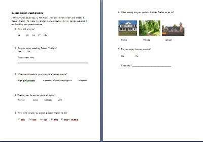
Questionnaire results

This is a print preview of my results for my questionnaire. I found out that the majority of the people asked did enjoy watching teaser trailers. I asked a total of 20 people. 12 enjoyed trailers, the other 8! This defiantly helped me as I now know that most people do actaully enjoy them.
This is another print screen on my results for another question. The question I asked this time was ' How long do you expect a teaser trailer to be?' There was a variety of results for this one. The main answer for this was ' 1 mintue'. Therefore now when I editing my trailer I will try and aim my trailer to be 1 minute.
Wednesday, 5 October 2011
My questionnaire
Here is a print screen of my questionnaire. I gave this out to 20 people in my school and also around my house. I hope the feedback from the questionnaire will help me create a trailer to suit everybodys expectations.


Monday, 3 October 2011
Week beginning 3rd October
Today was mine and Jo's first attempt of editing our trailer. We decided to use to schools apple mac computer. This was a very daunting task for me and Jo as we have never used one of these before. One of the first hurdles we came to, was figuring out how to clip round a video clip. After an whole hour of trying to work it out me and Jo finally managed to do it. Our first session of editing was pretty much just a play around. We flicked around all the different settings and editing tools and decided which ones we liked. We will be continue to edit during the week
Sunday, 25 September 2011
Tuesday 27th September
Today me and Jo filmed the our last shots of our trailer. We managed to film some pretty gory shots, using blood and knifes etc. It took alot of shots to get the final shot perfect. Finally we have finshed filming our trailer and now the hard part begins! editing it!
Saturday, 24 September 2011
Tuesday 20th September 2011
Today we started filming our trailer. We started the the beginning of the trailer, where the front door is shaking. Then it swicthes ot he letter box flapping. All these seperate sohts make it look very effective and interesting. We also filmed the man in the mask at the front of the door, which suddenly slams his hand and on the door. Also we filmed the shot in the mirror where the actor seems 'boo' written the mirror. She acts scared and screams.
Me and my partner have written down a list of shots and edits that we have to do for the coming tuesday. We have a couple of shots to do on tuesday. We are hoping to get our last main shot filmed on tuesday. Our last main shot is when the victim is tide up in the cupboard and she is screaming. Apart from that the other shots, are quick shots which wont take to long to do. So far I think our trailer is going very well and we hope to have it finshed very soon!
Me and my partner have written down a list of shots and edits that we have to do for the coming tuesday. We have a couple of shots to do on tuesday. We are hoping to get our last main shot filmed on tuesday. Our last main shot is when the victim is tide up in the cupboard and she is screaming. Apart from that the other shots, are quick shots which wont take to long to do. So far I think our trailer is going very well and we hope to have it finshed very soon!
Friday, 23 September 2011
My Questionnaire- My Primary research
I am have created and produced a questionnaire which I have given out t a number of my peers. From this I gathered evidence which is defiantly going to help me make my trailor.


Researching Horror Music
For my media trailer I would like to use certain horror music e.g scary noises/ screams etc. I have looked on youtube and have found a couple of really good sound clips of scray music. I am hoping to use these in my trailer
http://www.youtube.com/watch?v=wwNAwkulMF0&feature=related - Example 1- This music is very scary eery. It is constant scary sounds throughout. This is one of my favourtie peices.
Other Examples
http://www.youtube.com/watch?v=iLi6RrZodRU&feature=related
http://www.youtube.com/watch?v=yiWxMYSaVRQ&feature=related
Working with a partner
I have decided to create my teaser trailer with one of my close friends. We have a very good realationship and will work very well together. We have started to make mind maps and mood boards of our ideas for our trailer, which I will be scanning into my blog. I am also now beginning to put together a qestionnaire.
My target audience
I want to target my teaser trailer at ages between 16-19. I am going to make my teaser trailer quite scary and real life, this way any age younger it may scare them. To help understand what my target audience like, understand and want to see in a teaser trailer, I am going to be creating a questionnaire! I will being asking questions all about teaser trailer's and asking various questions that have outcomes which will help me to make my trailer interesting.
What is a teaser trailer?
A teaser campaign is an advertising campaign which typically consists of a series of small, cryptic, challenging advertisements that anticipate a larger, full-blown campaign for a product launch or otherwise important event. These advertisements are called "teasers" or "teaser ads". A teaser trailer is a short trailer used to advertise an upcoming film, television program, video game or similar, usually released long in advance of the product, so as to "tease" the audience.
Movie teasers, unlike typical theatrical trailers, are usually very short in length (between 30–60 seconds) and usually contain little, if any, actual footage from the film. Sometimes, it is merely a truncated version of a theatrical trailer. Tester trailers are usually only made for big-budget and popularly themed movies. Their purpose is less to tell the audience about a movie's content than simply to let them know that the movie is coming up in the near future, and to add to the hype of the upcoming release. Teaser trailers are often made while the film is still in production or being edited and as a result they may feature scenes or alternate versions of scenes that are not in the finished film. Other ones (notably Pixar films) have scenes made for use in the trailer only. Teaser trailers today are increasingly focused on internet downloading and the convention circuit
http://en.wikipedia.org/wiki/Teaser_campaign
My decided task
As I have decided to choose the teaser trailer task, I now have to start thinking of my teaser trailer. I need to think about location, actors, makeup and props.
BRAINSTORM
Location- House, street, road
Actors- Joanne
Editing- slow motion, cut in shots, rewinding, eye zoom, black and white to colour etc!
Props: fake blood, wooden chair, horror makeup
BRAINSTORM
Location- House, street, road
Actors- Joanne
Editing- slow motion, cut in shots, rewinding, eye zoom, black and white to colour etc!
Props: fake blood, wooden chair, horror makeup
Thursday, 22 September 2011
Research- Horror teaser trailer 2
This teaser trailer is promoting the film ‘ The Exorcism Of Emily Rose’. This trailer is showing the audience the background story. It is about a girl who is being possessed by the ‘devil’ which then they have to perform an exorcism. The first shot is of an white house in the snow, the music is very scary which already creates a dramatic effect. The screen shot that says ‘based on a true story’ this is a very big effect on the audience as it makes them feel more scared because they are being told its true! The choice of the characters name is very good clever, as I think the name ‘Emily Rose’ is very mysterious. The quick shot that shows Emily looking very scary is a good shot, as before the screen is black so your not expecting it. The music that builds up in-between each shot it very good also as it builds up a great effect of tension. The one bit which I really think is great it the heart beat effect, this really gets the audiences heart beating! And gets them scared! There are lots of little bits in this trailer which make it effective from fast shots, to sound effects! Overall I believe the teaser trailer is one of the best I have seen so far.
Research- Horror teaser trailer 1
As I have decided to make a film trailer based on a Horror genre, I now have to research some Horror trailers off of YouTube.
This teaser trailer is promoting the film ‘The strangers’. This trailer is very good and leaves me sitting on the end of my seat. The things I like about this trailer is the way at the beginning it creates a sense of security, showing the man and the women at the beginning all happy and relaxed. You don’t expect anything to go wrong. I also like the way the shots speed up, this creates tension! Also In this trailer I like the way the lights are always dark, there’s never a bright scene. Leaving the lights always dark during the trailer creates an effect of tension and defiantly leaves me feeling scared! The background song which is a diagetic sound is very clever. As the actors in the film are being watched/tortured by people in mask’s its as if they are being chased. The music played it called ‘Run Rabbit’ which emphasises this, as if the victims are being chased and trying to escape. I like the heading of this film as it again emphasises the strange people trying to break in and kill the married couple. I will be hoping to use some ideas from this teaser trailer in my own one!
Research- Film magzine poster 3
This magazine is called ‘Movie’ and is promoting the film called ‘The Truman Show’. Personally I don’t like this magazine very much. Its very dull and not eye catching. The colour are bright but it doesn’t catch my eye. I don’t like the font of the heading and I don’t like the way the its lines through the writing. I don’t like that picture of Jim Carrey on the front is its not very exciting. Its very old fashioned. I don’t like the way there is another colour round the pink text, I think it looks a bit tacky, I also don’t like the green colour of the heading I would not choose to use any ideas for magazine cover from this magazine.

Research- Film magazine poster 2
This magazine is called ‘Total Film’ and it is promoting ‘Alice in Wonderland’. The colours on this are very good. The purple and orange are very bright! Again the poster is very busy which makes it very eye catching and readable! I also like the way the picture of Johnny Depp is in front of the title! It makes it look very real life and interesting. I like the way it was other headings and titles of other films! I like this film poster very much and hope to use some ideas from this magazine! The only thing I dislike about this magazine is how the bar code is on the edge of the magazine, it makes it like really squashed. I think when I make my magazine it needs to be very busy and full of information and colour!

Research- Film magazine cover 1

This magazine is called ‘Empire’. It is promoting Harry Potter. The magazine front cover itself is very bold and eye catching. Its very busy and looks like there is a lot going on, which makes it look exceptionally good. The bold heading in red really stand out as the other text is in grey white and yellow. The picture at the bottom of the magazine looks really effective as the characters are popping out of the picture. This magazine defiantly makes me want to buy it and read inside it. The only thing I don’t like about this magazine if the writing on the ‘V’ of the M. Also I don’t like the way stars (*) are used. I think it looks a bit tacky.
My Research- Film poster 3
This film poster advertises the Exorcism of Emily Rose. The colours in this poster are very eerie. The colours consist ot white, which could be linked to a ghost figure, dark red which can symbolise blood. All the colours in which can be realated to this theme of a horror genre. The misty effect is very effective as it makes the audience uncertain of what’s behind the tree. It makes the audience want to no more about the film/ Also where the character is not facing the front makes the audience a bit uneasy as what the character looks like. It denotes again the horror genre of not knowing what the character looks like! TThe word 'Exorcism' is written in capital letters, which again stands out to the audiences eyes. The word Exorcism itself is linked to horror, devil and spritual beilefs which is scary enough. You can tell from one look that the Film Poster that it is horror genre and this is cruital for a film poster. I hope when I create my film poster that people can tell that my genre is horror. I like this poster very much and hope to use ideas from this poster in my own film poster. Overall this is one of my favourite posters as I have no negative comments about it.

Monday, 19 September 2011
My Research- Film Poster 2
This film poster advertises the famous 'Texas Chain Massacre'. The poster itself is very dark which created tenions and horror. The picture of the person is very faint which makes the audience a feel a bit uneasy about what the character is. The background being dark also makes the picture more apparant. Again as the bakgroundc is ompletely black this makes the picture of the man is very blurred, which created an atmosphere that the man himself doesnt want to me seen. This makes the audience un easy and confused. The white writing stands out and this catches the audiences attention and makes the audience read the writing. The I like this very as the writing stands out very well and the background is simple but bold. The picture of just the man is very simple but is very effective. The dark area around his eyes denote a sense of horror. Not being able to see the mans eyes adds to the effect of not knowing his identity. The only thing that I dislike about this poster is that there is hardly any colour involved, in which is comes across a bit dull and boring. It may not be eye catching for the audience and people may not stop to look at it. Although I do like the idea of the dark background and the light coloured picture it does go across a bit full. Although They contrast against one another and it does work well, the colours are slightly boring but it does work. I will hope to use idea of dark background and light coloured writing and picture for my Film Poster

Wednesday, 14 September 2011
My Research- Film Poster 1
For my task I will be creating my trailer, but also I Will be needing to create a film poster. I will be doing my research on various film poster magazines which I will find on goggle. I Will be focusing on colour, titles, text and the picture itself to help me create my own Film Poster.
 This poster is the poster the advertises the film, 'Nightmare on Elm Street'. The colours on this poster are very defined and dark. The colour consists of reds, browns, oranges and whites all to enhance the character himself and also the 'horror' genre. The writing is is red and white. The red writing can symbolise blood and also can symbolise attention and the action to 'stop'. The effect of the film title being bigger than the over text defiantly draws the audiences eyes to it. The picture itself is very effect. Freddie himself who is the evil character in the film, his eye site is facing down and the hat is covering his face. The denotes a sense of hidden secrecy, of hidden overall. It makes the audience want to see whats underneath the hat, and to see whats being hidden. Also he gesture with his hands are effect, his hands and cross and he knife finger on his right hands is his weapon. His hands being crossed creates a 'job done' effect. It makes him seen harmless and not afraid of anything. There is a light behind his head makes the audience want to also see whats behind him. It denotes a sense of him in the dark, and him being an evil character, and behind him is light and life like. Overall I think that this poster is very scary and advertises the film very good. As I have seen this film it fits with the genre very well. Also bellow the film title the date on the film coming out if written. All these little extra bits help the film poster very successful!
Tuesday, 13 September 2011
What is a film poster?
A movie poster is a poster used to advertise a film. Studios often print several posters that vary in size and content for various domestic and international markets. They normally contain an image with text. Today's posters often feature photographs of the main actors. Prior to the 1990s, illustrations instead of photos were far more common. The text on movie posters usually contains the film title in large lettering and often the names of the main actors. It may also include a tag line, the name of the director, names of characters, the release date, etc.
http://en.wikipedia.org/wiki/Film_poster
http://en.wikipedia.org/wiki/Film_poster
Tuesday, 6 September 2011
SUMMER HOLIDAYS!!
During the summer holidays it was are task to start creating and making or chosen task. I finally decided to create a teaser trailer genred at horror. I had to start thinking about a lot of things! I had to come up with a believable story line and also one that would leave the audience on the end of their seats. I had to start thinking about actors, the set, makeup! I found this very hard but I managed to get there! Most of all I had too purchase a video recorder to film it all on! My story line that I chosen is something that scares me! It has been done in alot of horror movies and I decided to be creative and have ago at creating a similar but different story line myself. My first shot, is a door shaking as if someone wants to come in but is not welcome, the door then starts to shake alot more stronger. During this shot I will be having words/sentences coming up on the screen aimed to keep the audience on the edge of their seat. E.g 'At night when your home alone, there's always someone not welcome' 'However hard you tell yourself that know ones not there..... what happens if there is?' these are not the exact line but i would like something like this, this will be the beginning of my trailer! I have a lot more things to do and add into my trailer but this is the beginning. I hope my trailer will be as scary and as good as I hope it will be! Since the holidays are over, I will now be concentrating more on the work and also the making of my trailer!
Friday, 8 July 2011
Past students teaser trailors
Today in media we looked at and discussed students own teaser trailers from last year. Seeing as I have chosen this option it was defiantly a great help to me. We discussed about the pro's and con's and also about the conventions of it, if it made sense, if the lighting was correct, the area setting etc and how little eras can really either make or ruin it! The sound/music/voice that is put into the trailer can really make it good. One of the trailers had a dramatic scream during the end, which made the class scream and left people on the edge or our seat, this really was an excellent idea and I would consider using this in my own personal teaser trailer. There are a lot of extra things I personally think that ‘make’ a horror teaser trailer effective. ETC music, sudden effects, the lighting, a false sense of security. I now know with my horror teaser trailer that I have to gain the audiences attention very quickly for them to pay attention to the rest of my trailer! I hope to be looking at some more horror genre teaser trailers before I begin to make mine. I am looking forward very much to making my teaser trailer!
Tuesday, 5 July 2011
Examples of music video's
Today in media we watched past students music videos. We discussed the pros and cons of each of them from our point of view. This really helped me because it showed me how a finished music video looks, and how much precision it takes to create and music video and also how little mistakes can totally throw the audience. Looking at and discussing other students music videos gave me a good idea of how much work was needed to be done. I helped me to understand a lot about all the different shots, and all the different things you had to think about. I discovered that for a lot of the students they had trouble with filming their music videos outside, due to pedestrians always walking past. Before I didn’t realise that this was a problem. It shows me how hard it is to film outside! Also a music video is a lot longer than a film trailer! From looking at past students music vidoe’s I hope to be creating a teaser trailer!
Friday, 1 July 2011
Examples of teaser trailers
In this lesson of media we were shown examples of very successful teaser trailers. We discussed what made they interesting to watch and what also drew are attention to wanting to go and view the film. We watched ' Transformers 3' and 'Twilight ' Breaking Dawn' which are all very good trailers. I know I will go to watch both as these films as the trailers left me wanting to no what happens next. We also watched the 'horror' genre of teaser trailer which caught my attention! The theme’s for the teaser trailer’s we watched were; action, horror, sci-fi and Rom-com. They all caught my attention straight away and believe that, this is the key to a successful trailer! At this point in time I am swayed more towards making a teaser trailer! I hope to view other trailers before I begin to make my trailer as it defiantly helped me a lot
Saturday, 25 June 2011
AN INTRODUCTION TO A2 MEDIA
This week in Media, we have been introduced to the task's which we can choose from. What we choose to do is our choice in which we will carry this out through to next year. At the moment I am still deciding whether to create a music video or a trailer.
The brief I have chosen to do is:
Promotional package for a new film to include a teaser trailer, together with:
* a film magazine front cover, featuring the film
* a poster for the film
The brief I have chosen to do is:
Promotional package for a new film to include a teaser trailer, together with:
* a film magazine front cover, featuring the film
* a poster for the film
Subscribe to:
Comments (Atom)